| Fundamentals of Statistics contains material of various lectures and courses of H. Lohninger on statistics, data analysis and chemometrics......click here for more. |
|
Home  Basic Concepts Class Information Basic Concepts Class Information |
|
| See also: Classification vs. Calibration, Histogram |   |
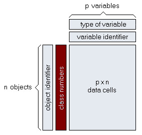
Class InformationSome of the most frequent tasks of statistical data analysis are the classification (categorization) of observations and the interpretation of classified data. The classification in its simplest form is based on the assignment of a class number (or, in more general form, of a class property) to each observation.
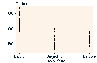
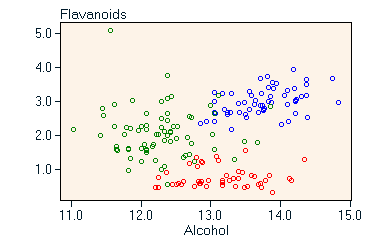
As an alternative to a dedicated storage vector (red region in the figure above) the class information may equally well be stored as a normal variable of the data matrix. This brings the benefit that class information (if coded in numerical form) can be used for calculations and can directly influence, for example, the color coding of results. On the other hand class information as part of the data matrix includes the risk of mixing up class information with explanatory variables, which may pose problems in certain circumstances. Displaying classified data When displaying classified data we can distinguish three basic types:
|
|
| Home Basic Concepts Class Information |
|