| Fundamentals of Statistics contains material of various lectures and courses of H. Lohninger on statistics, data analysis and chemometrics......click here for more. |

|
Home  Univariate Data Distributions Probability Plot Univariate Data Distributions Probability Plot |
|||
  |
|||
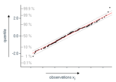
Probability PlotA recurring question is the question whether a particular distribution (i.e. a normal distribution) is a suitable model for the measured values. This is especially important because many statistical procedures make assumptions on the distribution of the data. Further, the form of the distribution may allow insights on the properties of the process under investigation. For example, we know that if the time until failure of a device is distributed exponentially we can conclude that the failure rate of this device is constant over time,. One of the most often used tools for visually recognizing a particular form of a distribution are histograms. However, histograms require a relative high number of observations in order to be able to recognize the type of the distribution. Further, small samples exhibit problems with class boundaries, which may change the conclusions when the class boundaries are shifted. Early in the history of statistics these problems led to "probability paper" to check a distribution for normality. A more timely form of the probability paper are probability plots. In order to create a probability plot the observations have first to be sorted in ascending order. The sorted observations x1, x2, ..., xj, ... xn are assigned rank numbers j (in the range of 1 to n). The sorted observations are then plotted against the quantiles of the cumulative frequencies (j-0.5)/n. The quantiles have to be calculated from the distribution to be tested for.
If the data points in this plot are located approximately along a straight line, it can be concluded that the selected distribution correctly represents the data. How much individual data points may deviate from the line is certainly subjective and depends on the number of observations. In practical applications one should pay more attention to the 90% of the data in the middle of the plot and less weight to the data at the lower and upper boundaries.
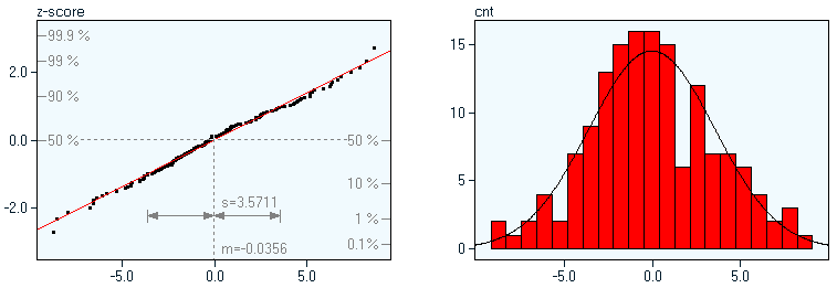
The following examples show samples of 150 observations each, drawn from different distributions; at the left you see the normal probability plots, the images at right display the corresponding histograms. normal distribution (skewness: 0.111): the values in the probability plot are located along a straight line
distribution skewed to the right (skewness: 0.870): the values of in the probability plot form a curve bending down
distribution skewed to the left (skewness: -1.363): the probability plot shows a curve which is bending up
|
|||
| Home Univariate Data Distributions Probability Plot |
|
||